
Weir Hairdressing are a well established hairdressers in Elgin with a great reputation.
However their shop frontage and overall image was looking a bit dated and didn’t sit with this modern, forward thinking salon.
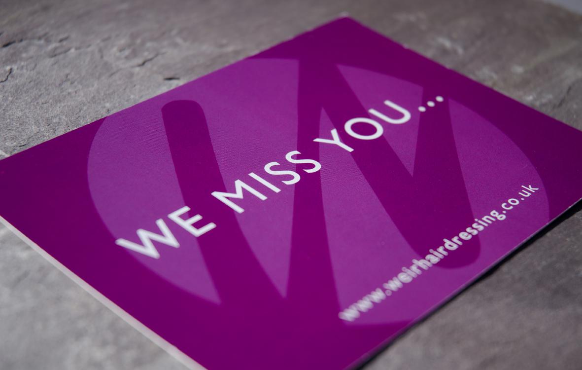
I designed a circular graphic that uses the ‘W’ of Weir as part of the logo, to create a striking icon that can be used on its own or with the full text. Choosing a funky purple and grey as the corporate colours, this has been used on the shop frontage, gift vouchers, appointment cards and postcards. The ‘W’ icon has also been used as frosting on the main windows and internal mirrors to help carry the branding throughout the salon.

logos | stationery | leaflets | brochures | newsletters | pull-up banners