With a new brand Gary Thomson’s aim is to become the ‘go to’ platform for online Math tuition. The design needed to be professional, but not intimidating. The company approach is to help you enjoy math, rather than feel afraid or intimidated by it, or by the tutors.
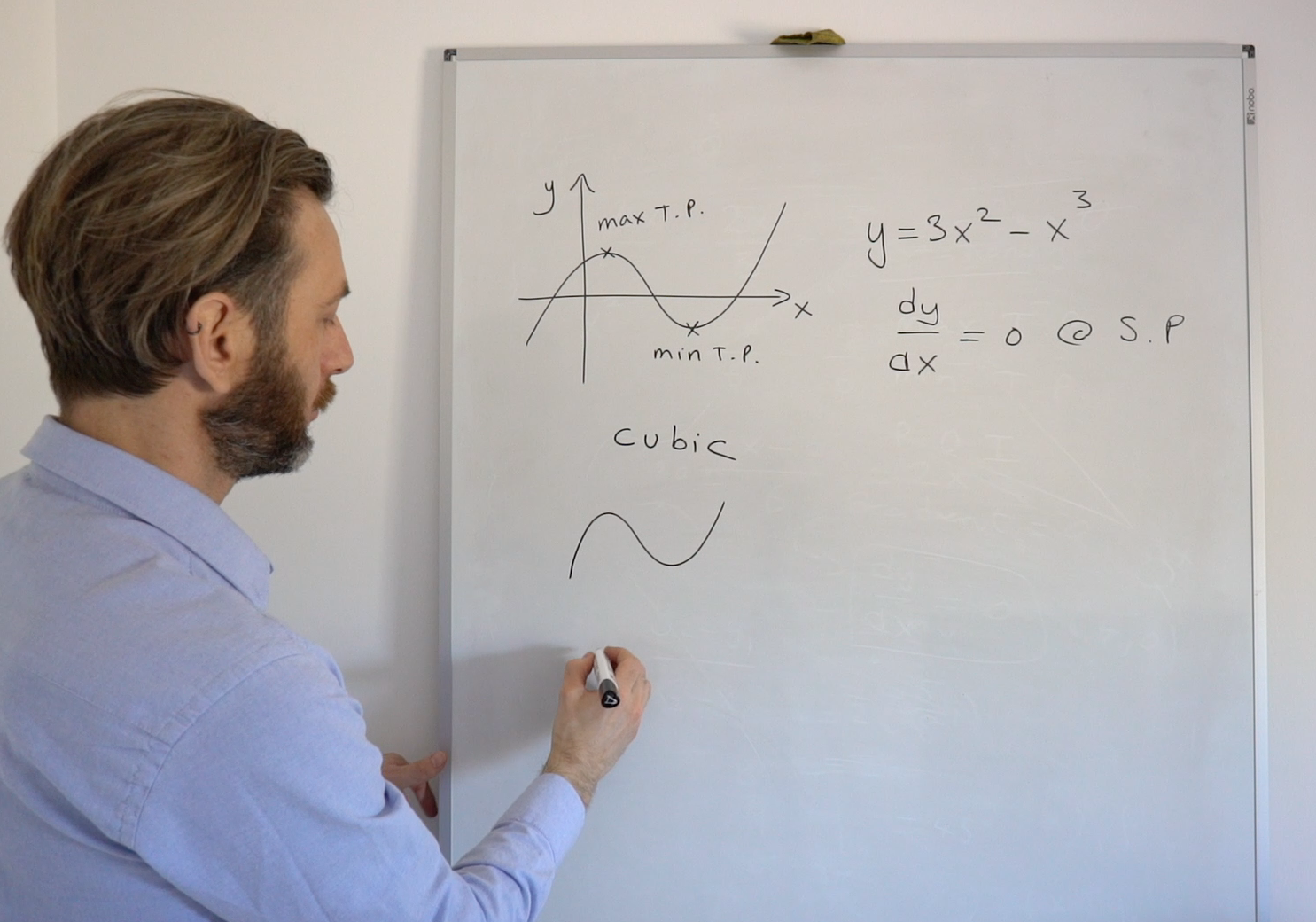
Having watched some of the sample maths tuition videos created by My Maths Guy I picked up on the symbol for a cubic function, and thought that this would make a great device to sit alongside the wordmark. It’s relevant, and makes a great design whether you know what it is or not.
I also created a set of basic brand guidelines to ensure that any subsequent material produced was consistent with the overall design.


logos | stationery | leaflets | brochures | newsletters | pull-up banners