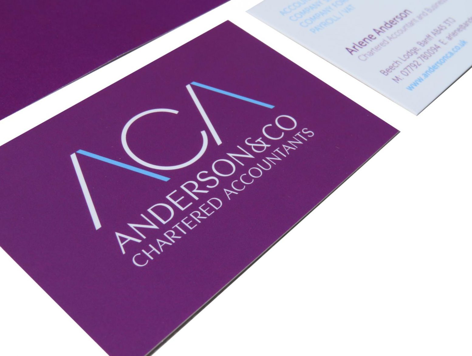

Arlene Anderson approached clockstudio to create a logo for her when she started her new accountancy business.
She wanted a professional looking design that wasn’t associated with the associated stuffiness of a traditional accountant. Keeping the design very simple and in just two colours has given her a timeless, striking design, that works well on various platforms; printed and virtual.
The web designer then took this design and used it as the basis for the website design, adding in some additional graphical elements, that we’ve since been able to use on more recent literature – postcards, report covers and adverts.
logos | stationery | leaflets | brochures | newsletters | pull-up banners