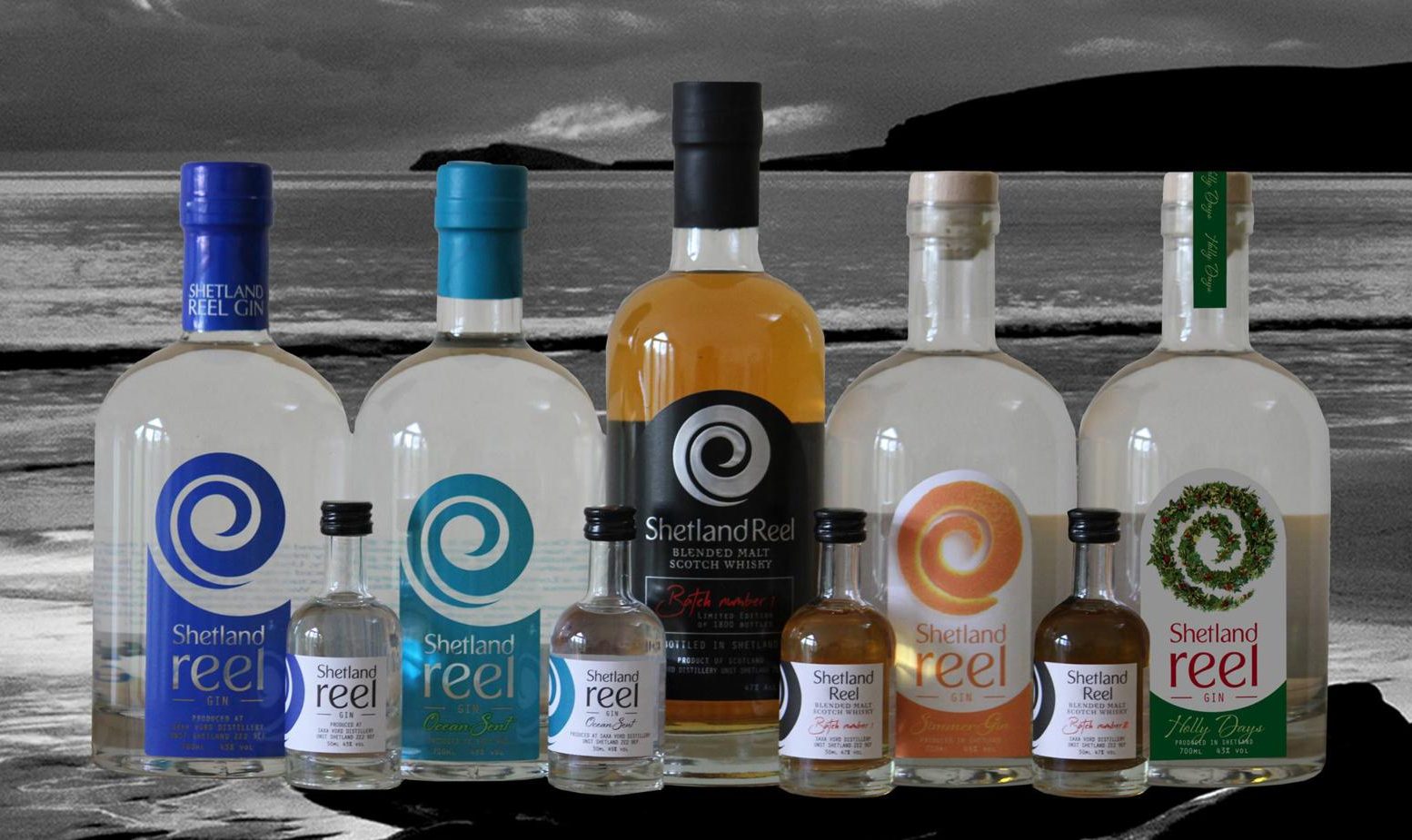

The first distillery on Shetland, on the most northerly inhabited island of Unst.
Not the easiest of places to get to, but so worth the effort!
clockstudio were approached to come up with a design for this exciting new project, that would appeal to an ever-increasing gin audience, both young and old, and most importantly to connect with Shetland as a unique destination.
Initial designs were inspired by a lyric that was written by the award winning musician Jim Salestrom, he had written a jingle to launch the gin, prior to it being produced;
“Shetland Islands are wild and the sea is alive”.
The swirl icon represents the swirl of an ocean wave, and the curve within the neck of a violin, linking to Shetland’s close ties with traditional music reels.
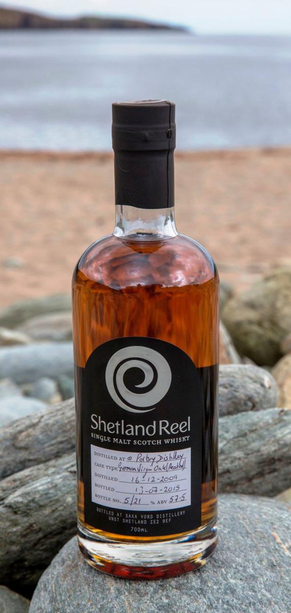
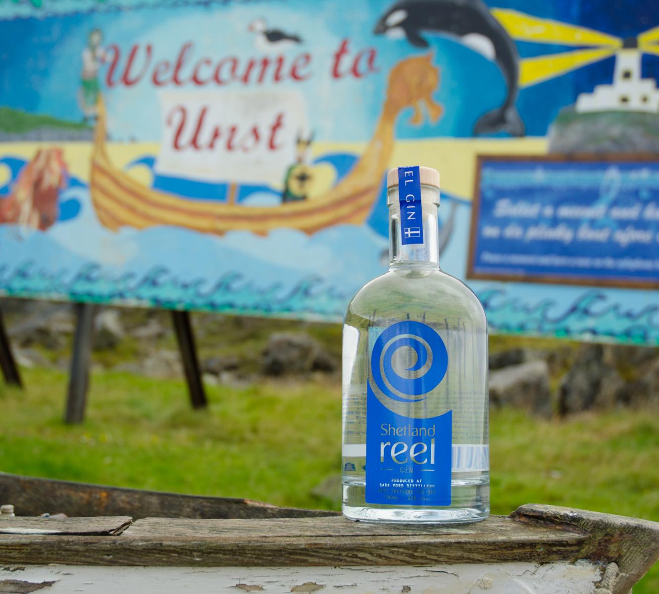
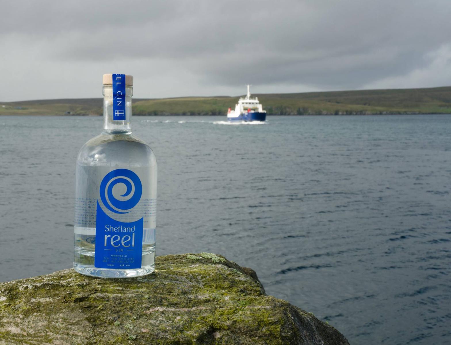
“Clare at Clockstudio worked closely with us to create our branding, and what has become our recognisable swirl. At the original design brief she took our ideas and thoughts about our product and what we wanted our brand to represent. She designed a unique brand proposition that represented all of our values and ideals. As the brand has evolved over the last few years we have maintained the original core values and trade-mark logo which is instantly recognisable by consumers.”
Stuart Nickerson
Director, Shetland Reel Gin
logos | stationery | leaflets | brochures | newsletters | pull-up banners